NM India Sourcing Sourcing Pvt. Ltd.- Logo Design Case Study
NM India Company Profile
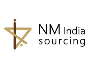
NM India Sourcing Private Limited is a sourcing partner for overseas buyers to source Industrial Products & services across the length and breadth of India. NM India Sourcing provides product sourcing and product development from our vast network of ISO and TS certified factories. Their goal is to create a stable economical sourcing base for international as well as local consumers, who wish to source the highest quality of technical products and services. Yashus designed a futuristic, contemporary and eye-catching logo which perfectly represented NM India Sourcing’s business vision and aimed to improve their brand visibility through subtle colour pallets and clean designs.
Request a Case Study

Challenges:
- To create a unique, attractive and timeless logo which clearly showcases the key business attributes such as speed, quality and affordability.
- The logo design must be clean, coherent and convey overall aesthetics of the business such as trust and expertise.
- Designing a logo that instantly conveys brand credibility and message through soothing colour tones, clear designs and the use of minimum elements.
- Craft a design that merges creativity with commercialism and adds value to the brand name ‘NM India Sourcing’.
Solutions:
- Our experienced logo designers have a keen eye of detail and they managed to design a logo that perfectly reflected NM India Sourcing’s sourcing expertise and brand personality.
- We followed the ‘KISS’ method- Keep It Simple Stupid by using simple visual aesthetics that would allow the logo to remain timeless throughout future trends.
- The colour blue was picked to be the primary colour as it is the colour of knowledge and it clearly signifies depth and stability inspired trust.
- The secondary colours of red and black were woven into the blue to inspire a sense of visual strength combined with energy, passion and elegance.
- Elements with a clean and thin line were selected to conceptualize the logo.

Results:
- The newly designed logo provided an identity, a story that perfectly narrated the business goals, brand personality and industry experience of the client.
- The logo provided the online audience with an attractive visual element to associate with the name ‘NM India Sourcing’ thus making their presence more prominent across digital platforms.
- It also provided headway to branding several products with the NM India Sourcing name and logo thus re-enforcing and creating an impression on potential consumer’s mind.
From The Client
We were highly impressed with Yashus’ creative spirit and meticulous planning. They perfectly pinpointed our brand personality and used soothing yet attractive colour tones that perfectly represented our business emotions through clean elements. They even managed to portray the motto of our business and instil emotions of trust and experience in the logo which a true testament to their attention to detail and their creative intelligence. We experienced a tremendous rise in brand recognition after the logo was launched online and used for branding. We would like to give the Yashus team big thumbs up for their effort and professionalism and we hope to work with them again in the future.


